Appearance
Customize the theme of your Prebuilt app, ensuring it aligns with your brand identity and user experience preferences. Preview your changes on the go, once saved you can test these changes on Prebuilt links and our native apps. This documentation will guide you through the various appearance customization available within the Prebuilt Customizer.
Head to 100ms dashboard, choose an existing template or create a new one. Jump to Customize Prebuilt and customize Prebuilt's default appearance.
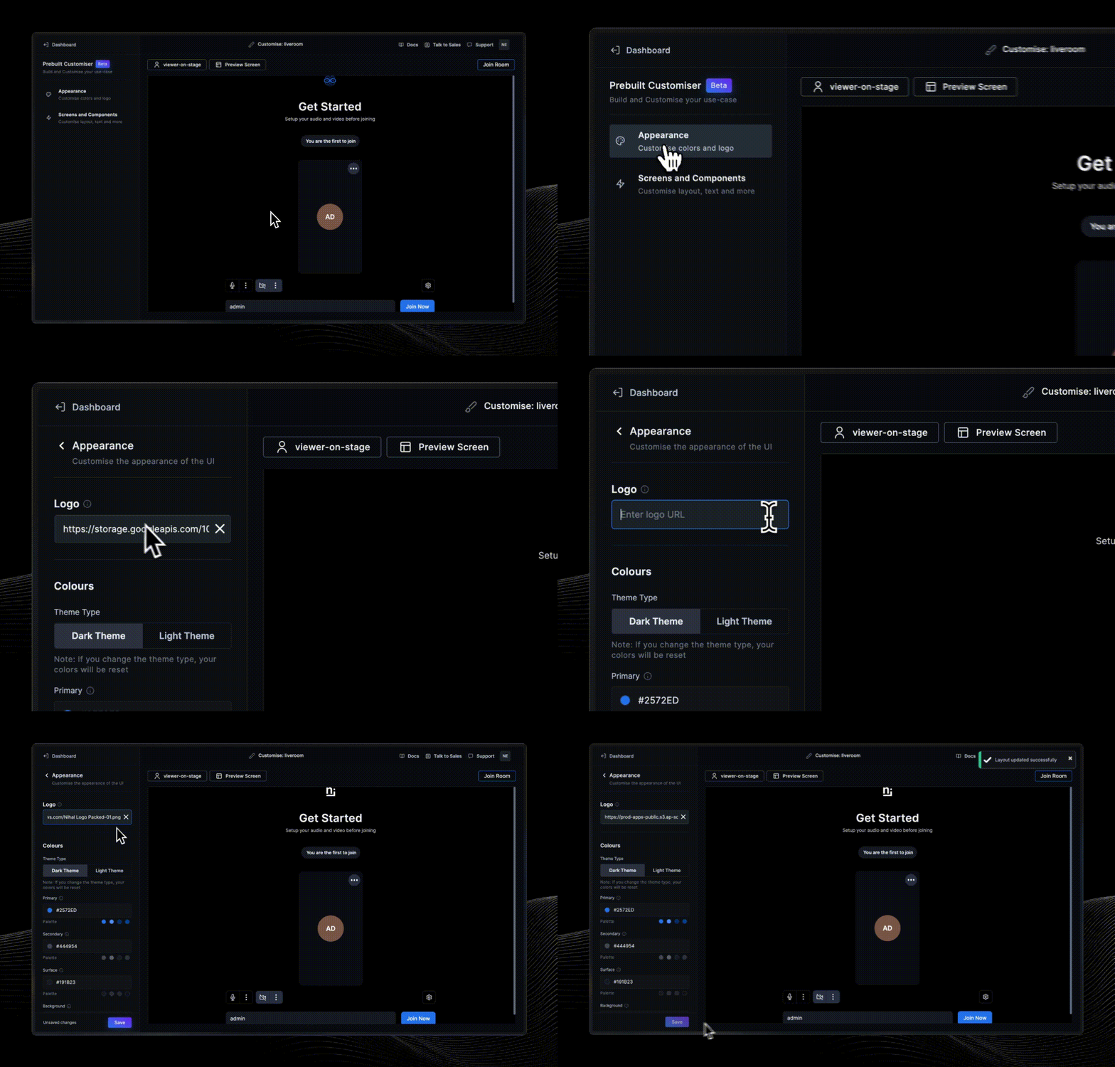
Changing Logo
You can easily replace the default logo that appears on the Prebuilt interface with your own logo. To do this, click on "Logo" input field and upload your custom logo image. Ensure that the image meets your desired dimensions. The supported image format is .png. For best results, upload an image with a transparent background.
Switching Between Dark and Light Themes
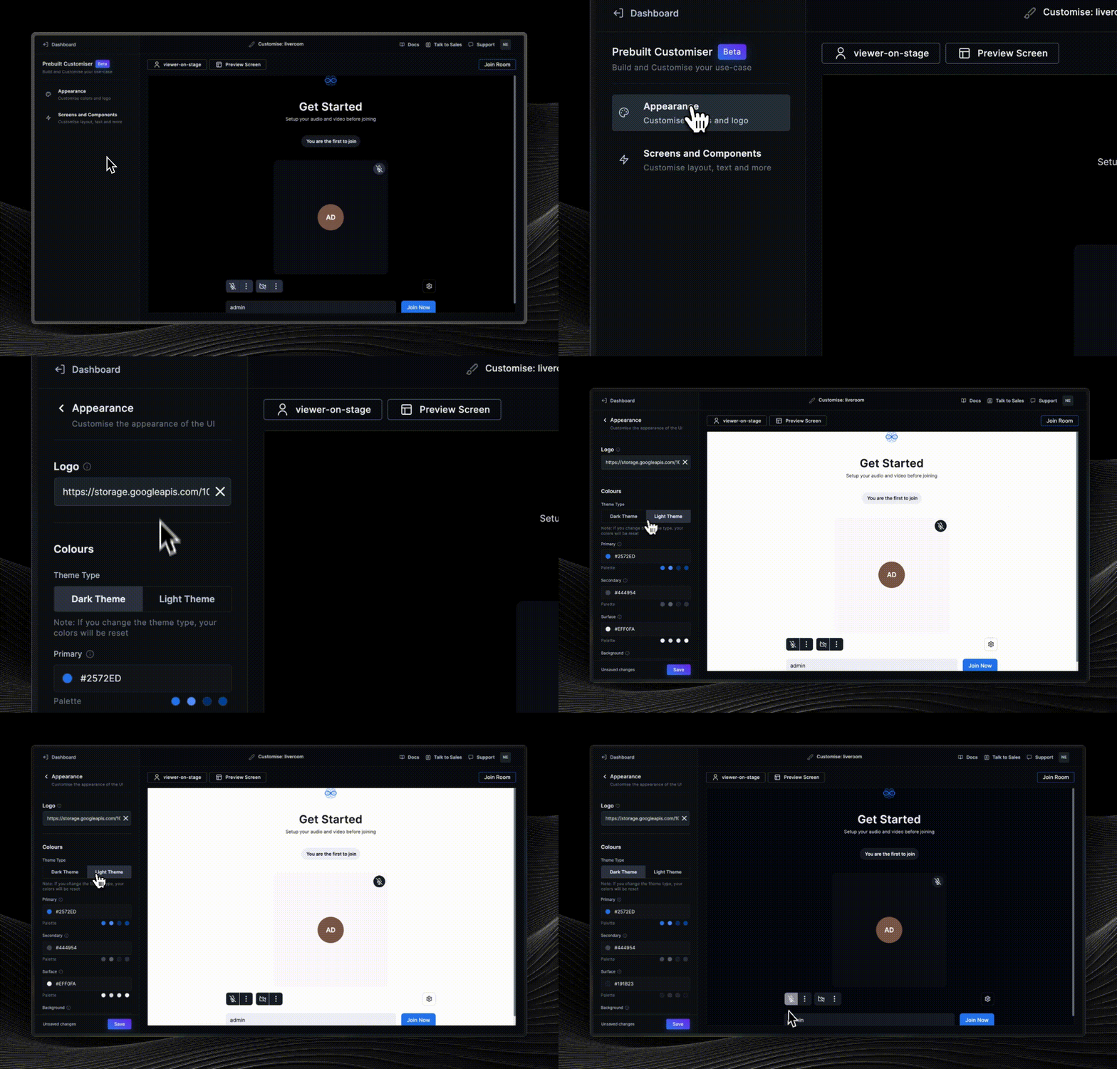
Prebuilt offers two distinct themes for your app: a dark theme and a light theme. You can choose the one that best suits your app’s aesthetics.
Once you toggle the theme switch to select either the dark or light theme, your Prebuilt app will be displayed with the selected theme.
Selecting between a dark or light theme is crucial for setting the fundamental visual structure of your app. While the choice may appear limited with just two themes, these themes form the canvas on which your color tokens are applied. This ensures a unified and harmonious design, aligning with your brand and elevating the overall user experience.
If you change the theme type, your color customizations will be reset. Be sure to reconfigure your color settings under Color Tokens section after switching between the dark and light themes to maintain your desired appearance.
Color Tokens
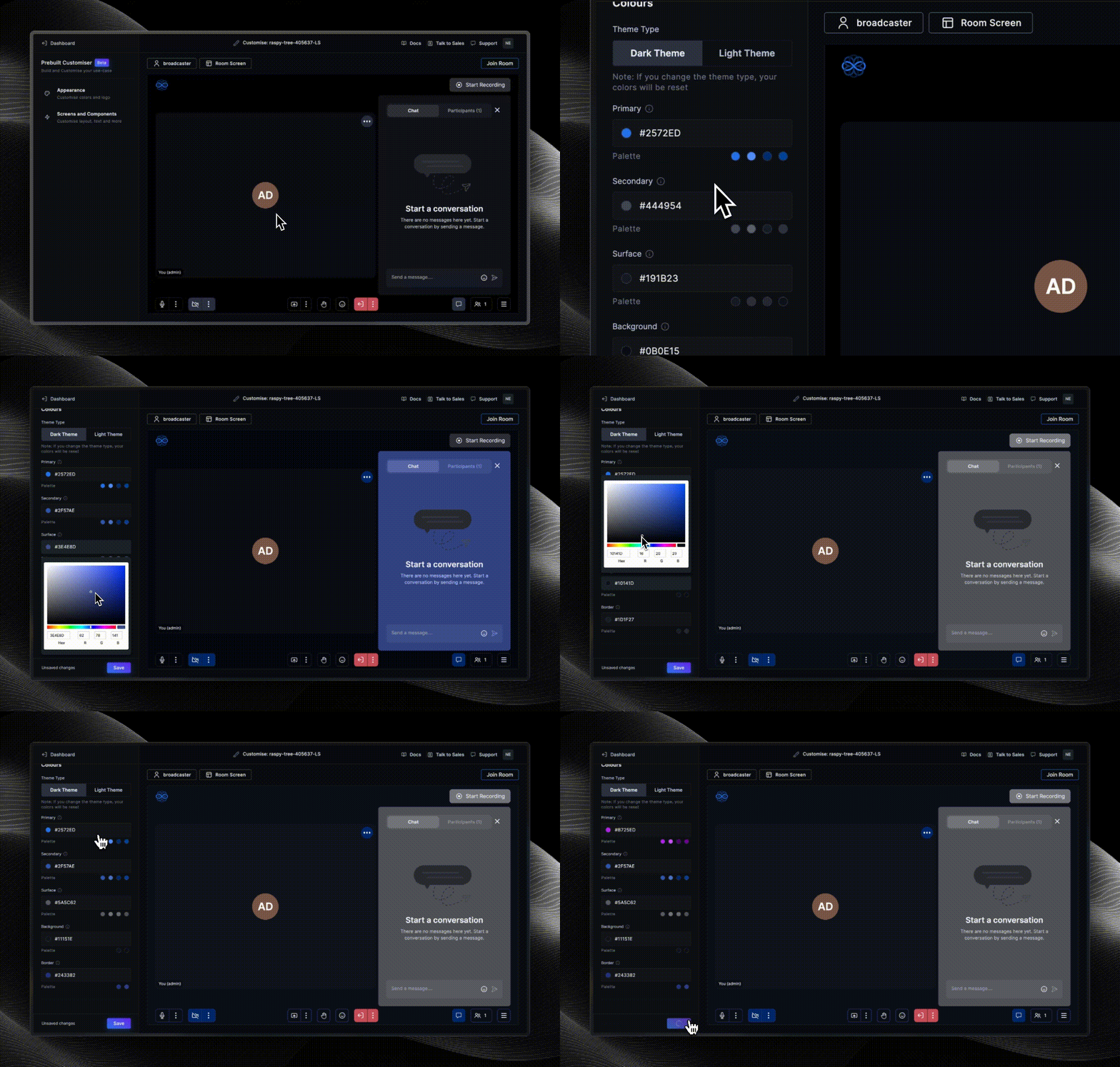
Color Tokens allow you to customize various color aspects of the Prebuilt user interface, ensuring consistency with your brand or app's design. To customize any of the colors, adjust the color values for each color variant according to your preferences. You can input a hex code, enter RGB values or select from the color picker. Click the Save button to apply the changes.
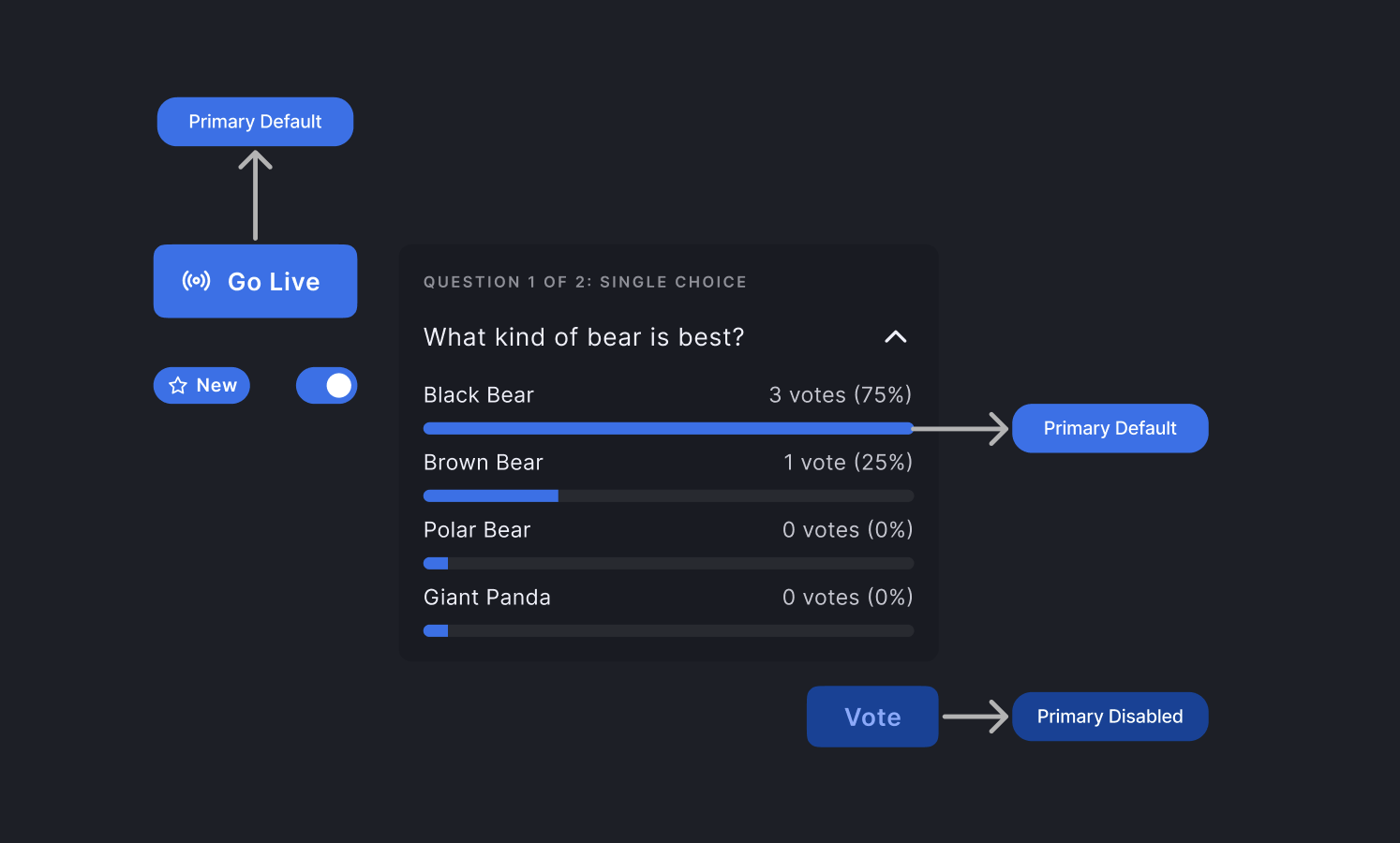
You only need to modify the default color value; the other color roles are automatically generated to maintain a consistent color scheme. For example, changing Primary color value generates Primary Default, Bright, Dim and Disabled.
Primary Colors
The primary colors play a crucial role in defining UI elements that reflect the brand color, especially main elements like primary action buttons.
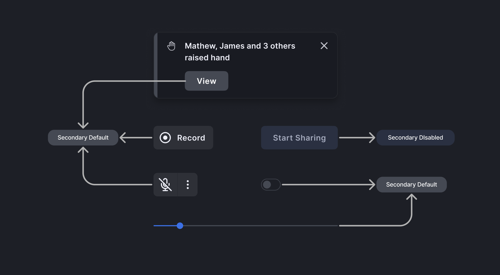
Secondary Colors
Secondary colors are used for UI elements that reflect the brand but with lower emphasis like secondary buttons, offering contrast to primary elements.
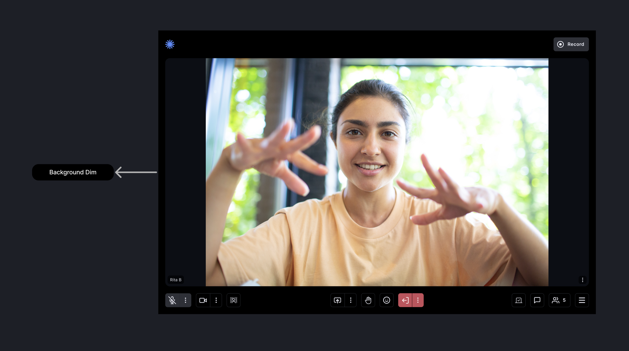
Background Colors
Background colors are used for the base layer situated behind all content and UI elements.
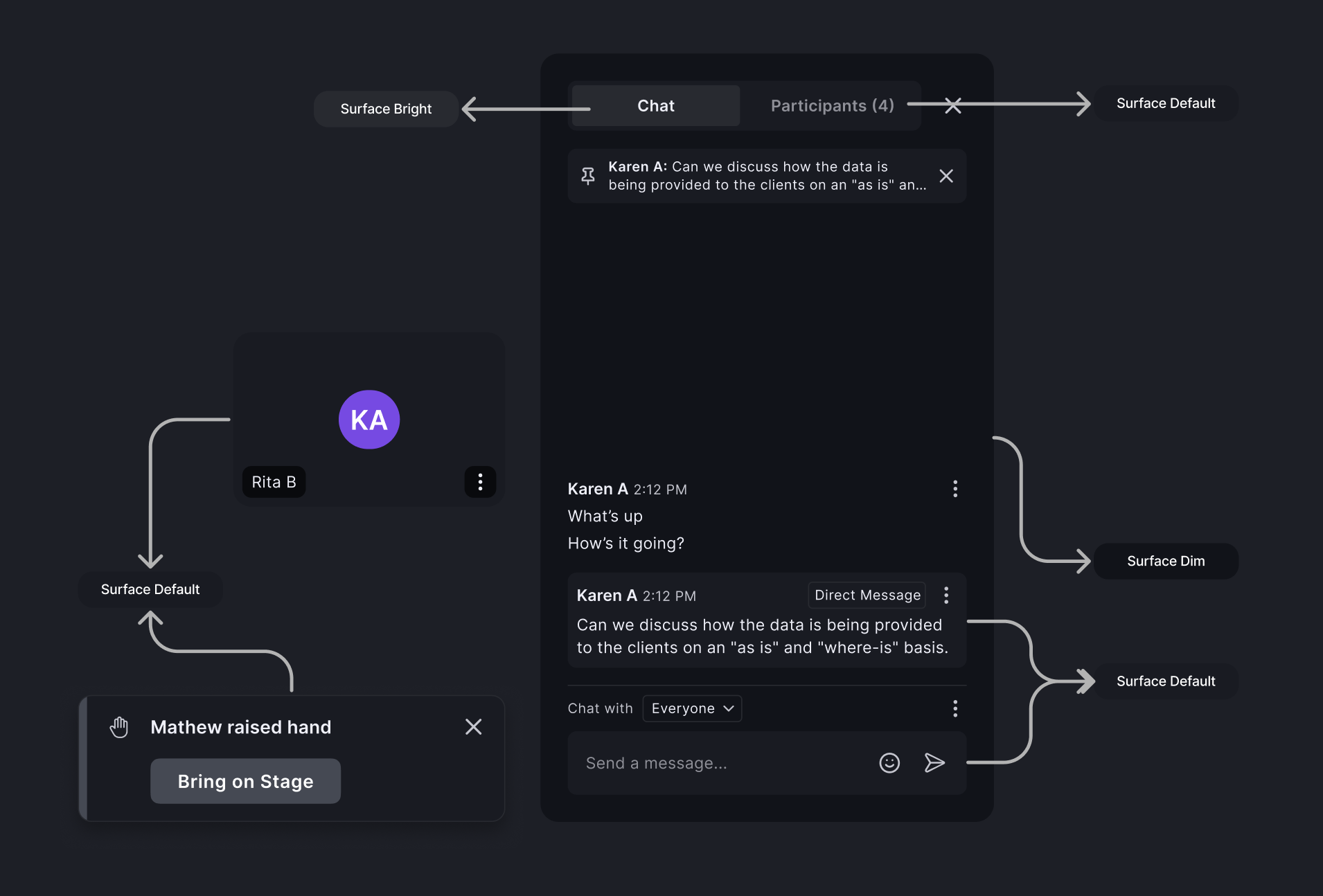
Surface Colors
Surface colors define contained areas, distinguishing them from a background and other on-screen elements.
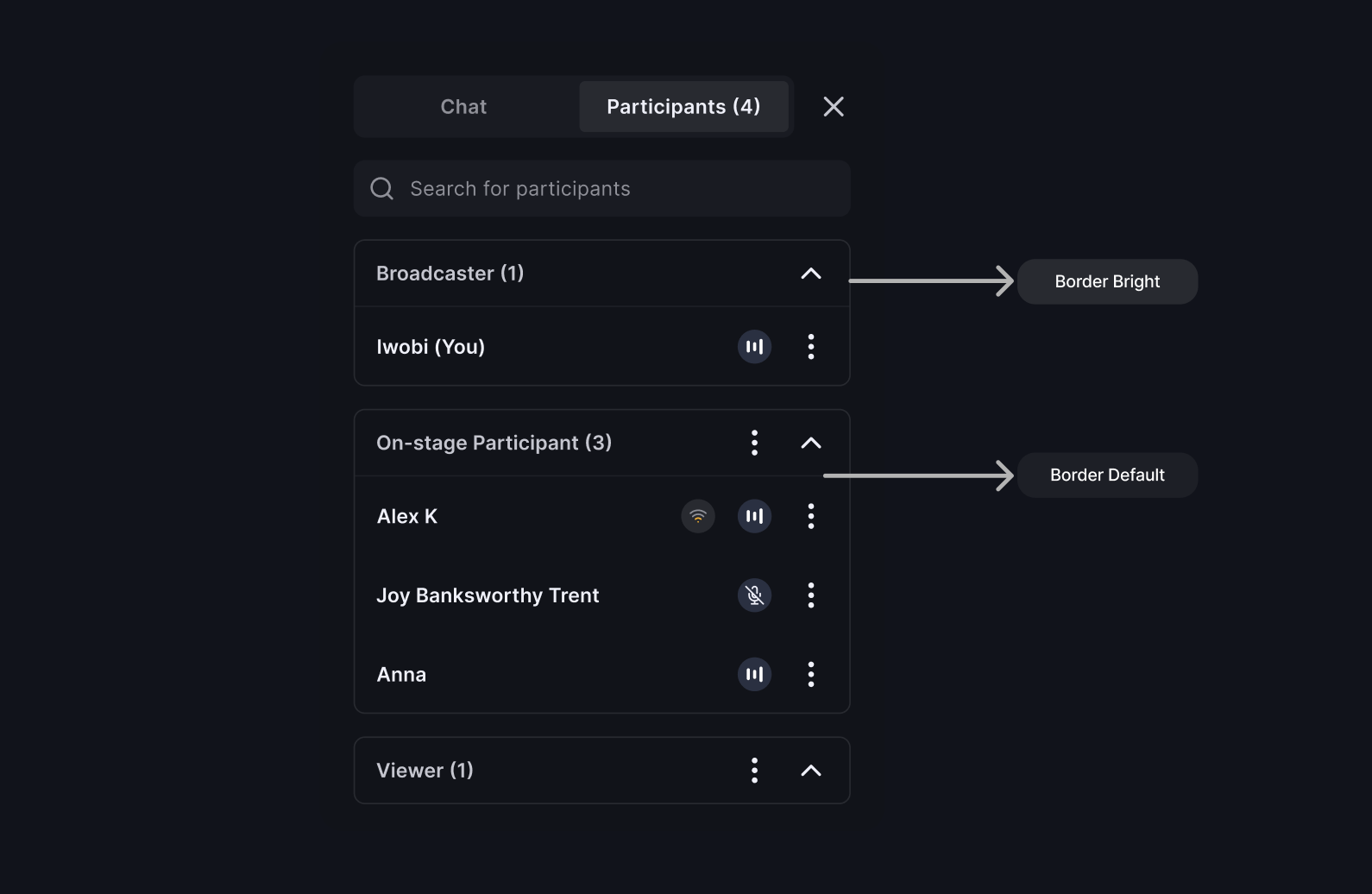
Border Colors
Border colors create boundaries and emphasis to improve usability.
With these customization options, you can tailor the appearance of your Prebuilt app to match your brand and user interface design preferences, delivering a unique and engaging experience to your users.


