Home
/ Blog /
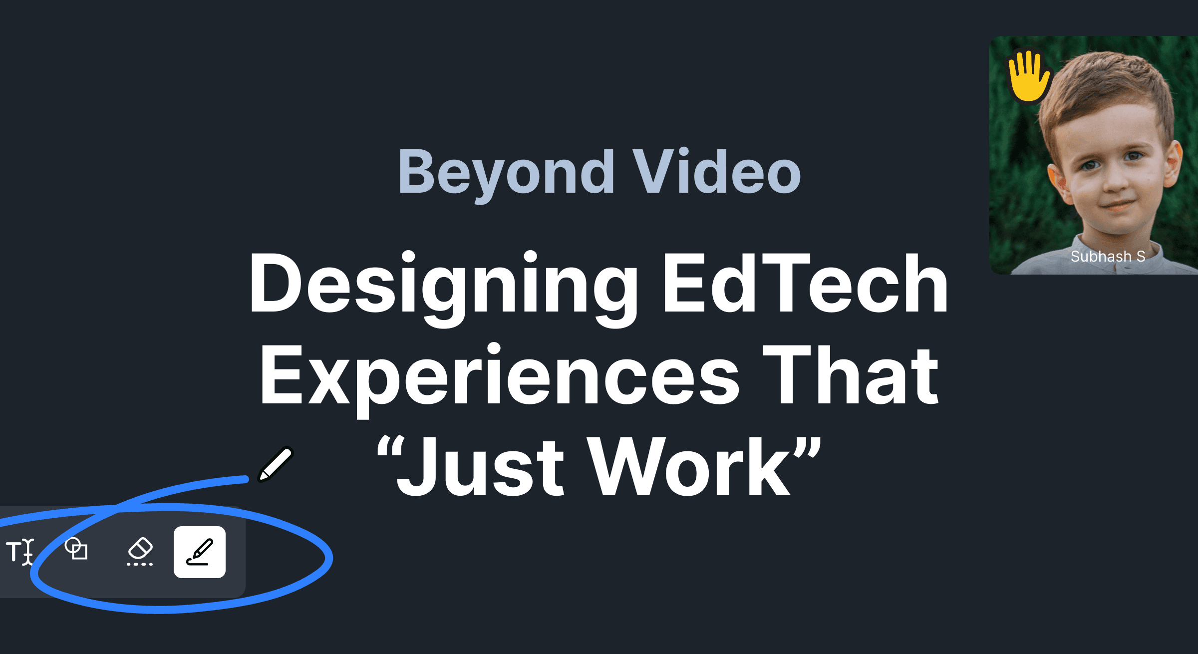
How 100ms designs Virtual Learning tech that "Just Works"How 100ms designs Virtual Learning tech that "Just Works"
October 21, 20226 min read


Share


In a post-pandemic world, most of us spend more time at home. And to improve our lives, companies are solving challenges in virtual learning/live classrooms, events, telehealth, fitness, among others.
100ms is helping companies that want to launch fast and learn fast with an all-around solution that works right out of the box.
That way, companies can focus on the core aspects of their business instead.
We started with solving challenges in the education technology Ed-Tech space. Let’s take a deep dive into how we designed EdTech experiences that “just work”.

Understanding everyone’s needs
Product designers work at the center of business, product, technology, and users. Each stakeholder has their needs — from teachers to students, product managers to engineers.
The closer to reality we operate, the better we can serve our users.
Read our popular blog on how to add Live Interactive videos to your product.
Making Virtual Learning Efficient - What Edtech companies want to achieve
We spoke to product people and teachers working at EdTech companies. Here’s what they want:
🪡 Tailor-made products: Edtech companies are using clients like Zoom and Google Meet as ad hoc solutions, but want a more tailor-made product for teachers and students.
😌 “Just works” experience: EdTech companies want their teachers to have a seamless experience while presenting slides, whiteboarding, and annotation. Screen sharing and remote browsers are frictionless ad hoc solutions.
🔐 Security and privacy: Securely inviting people, protection against Zoombombing.
📊 Analytics: Rich analytics and complete control over user data.
🍸 Quality of life features: Virtual backgrounds, “end room for all”, “mute all”, and features designed to delight end users.
🧑🏻🎓 Serving end-users: Keeping students and parents happy, of course!
Who are the stakeholders?
We classified stakeholders into two groups and identified their needs:
- Primary stakeholders: C-suite executives, product managers, or engineering managers. They are the primary decision makers working with 100ms.
- Secondary stakeholders: developers, teachers, students, and parents. Their needs heavily influence the primary stakeholders.
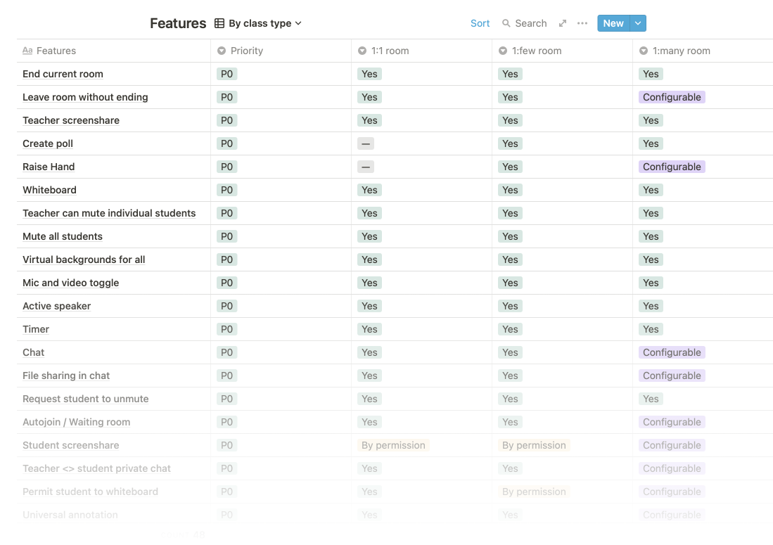
Translating needs into features
Understanding the needs of all stakeholders gave us insights. Every feature would now have a solid rationale behind its existence.
Design and Product worked together to make a prioritised feature list:
Thinking in design systems
Keeping the needs of stakeholders in mind, we invested time in building a robust design system that could scale across any configuration of features.
Here’s how we did it.
Smart tradeoffs to limit chaos
Seen one of these plates in the Buffet halls of any typical university?

This thoughtfully designed plate can organize everything from Salad to Soup and from Salmon to Risotto. Moreover, it’s easy to maintain, stacks well, and lasts a lifetime.
It limits chaos without sacrificing user experience.
Taking a leaf from this, we bet on this constrained—yet well-considered—layout to handle all our use cases:

It worked well, and we could even skip the sidebar in many cases.
Measure twice, cut once
Continuing with the theme of keeping tight constraints, we designed a few components we could reuse in multiple cases. To maximize reusability, we made sure to:
- Make components robust by designing every possible state
- Make components modular by carefully crafting them to be compatible with each other
For example, here’s our list item component:
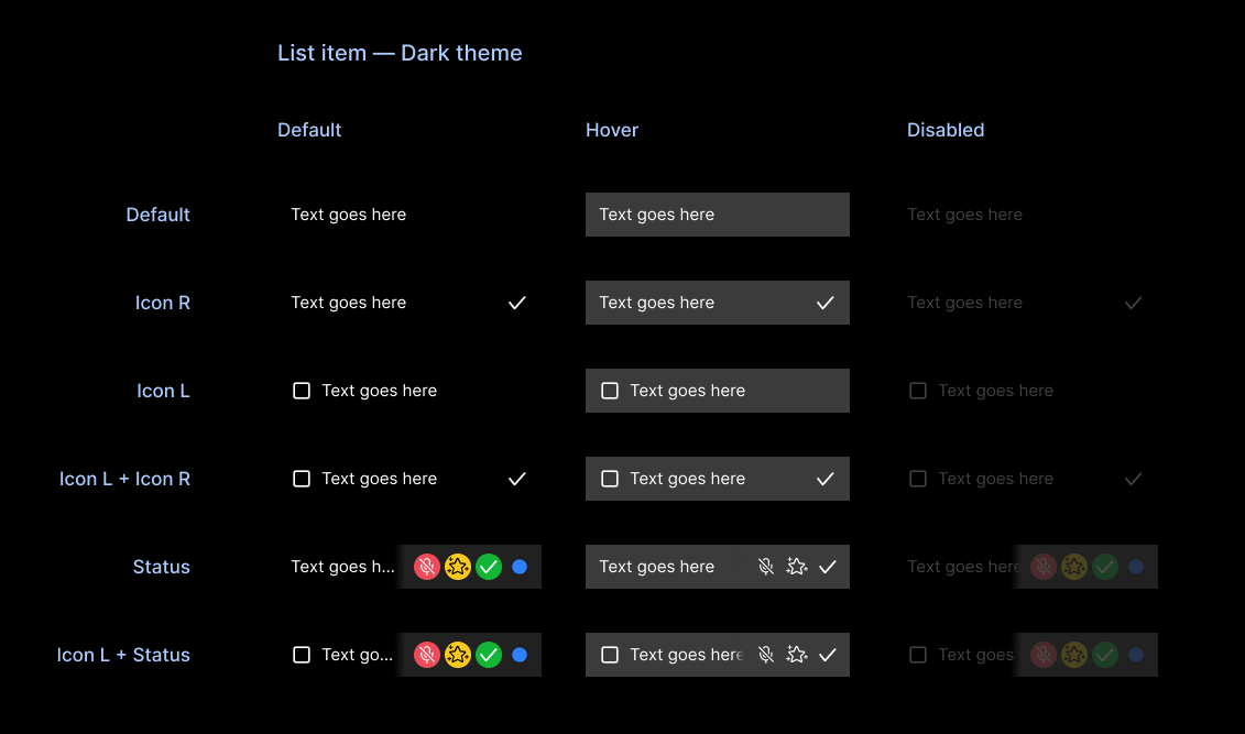
This component could be used anywhere by carefully selecting the text style, height, padding, and icon size. It could even reuse the generic input box as a search field and still look like a consistent, cohesive whole — no extra component needed.
Fewer components ➡️ less code ➡️ fewer bugs ➡️ happier users!
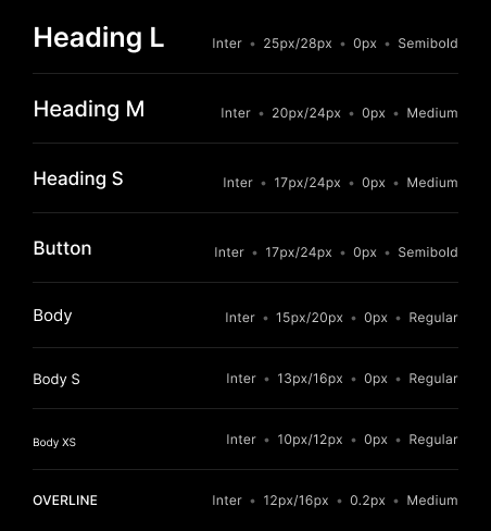
Choosing a typeface and icon set that “just works”
We needed a workhorse icon set and typeface that could handle anything.
- It had to work well at small sizes and in other constrained scenarios
- It had to blend into the interface and not call attention to itself
- A unique personality was not a priority for us
We licensed Streamline Icons and also made a few icons from scratch.
And we used Inter as the default typeface with a small set of typestyles.
Opinionated defaults
By thoughtfully picking defaults, we own the responsibility to make a great experience instead of deferring it to the user. If they like, users can override them with their preferences, but we hope they won’t need to very often.
Opinionated defaults let users spend precious mental energy on more important action items.
Bringing it all together - Live Classrooms with 100ms
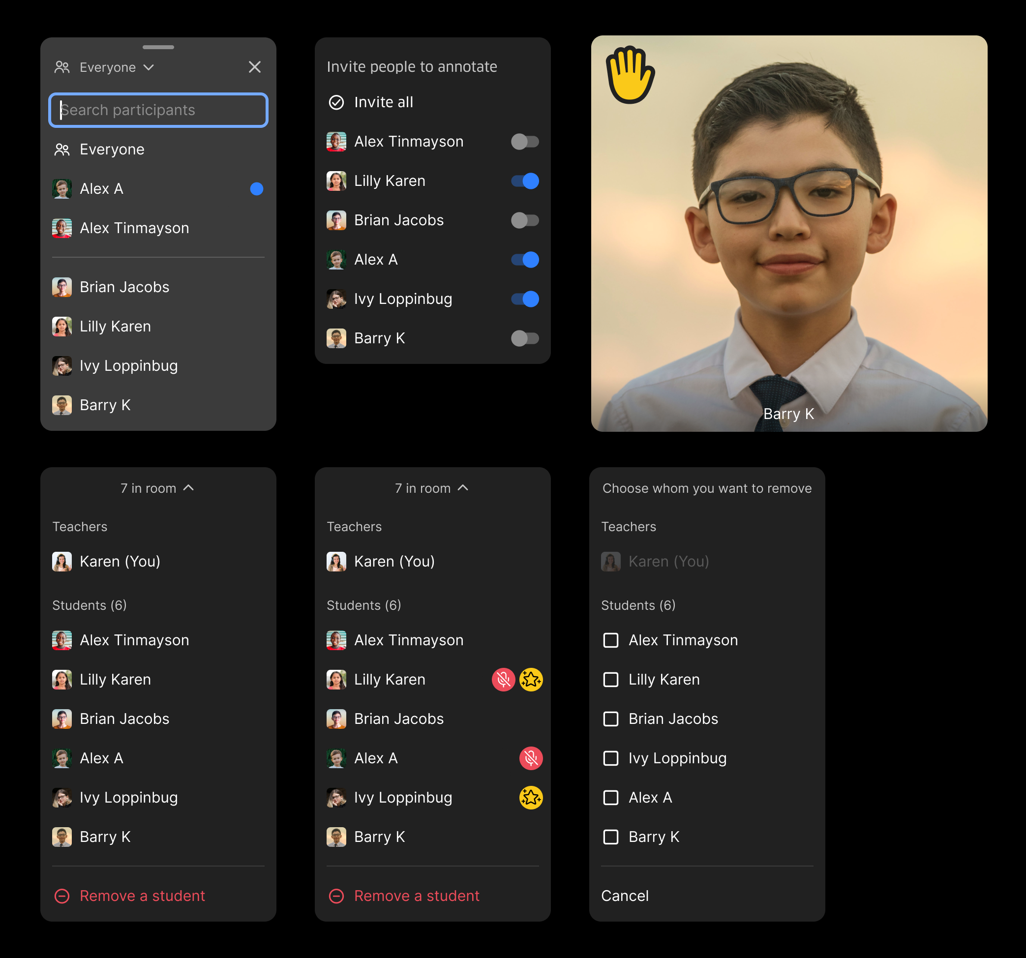
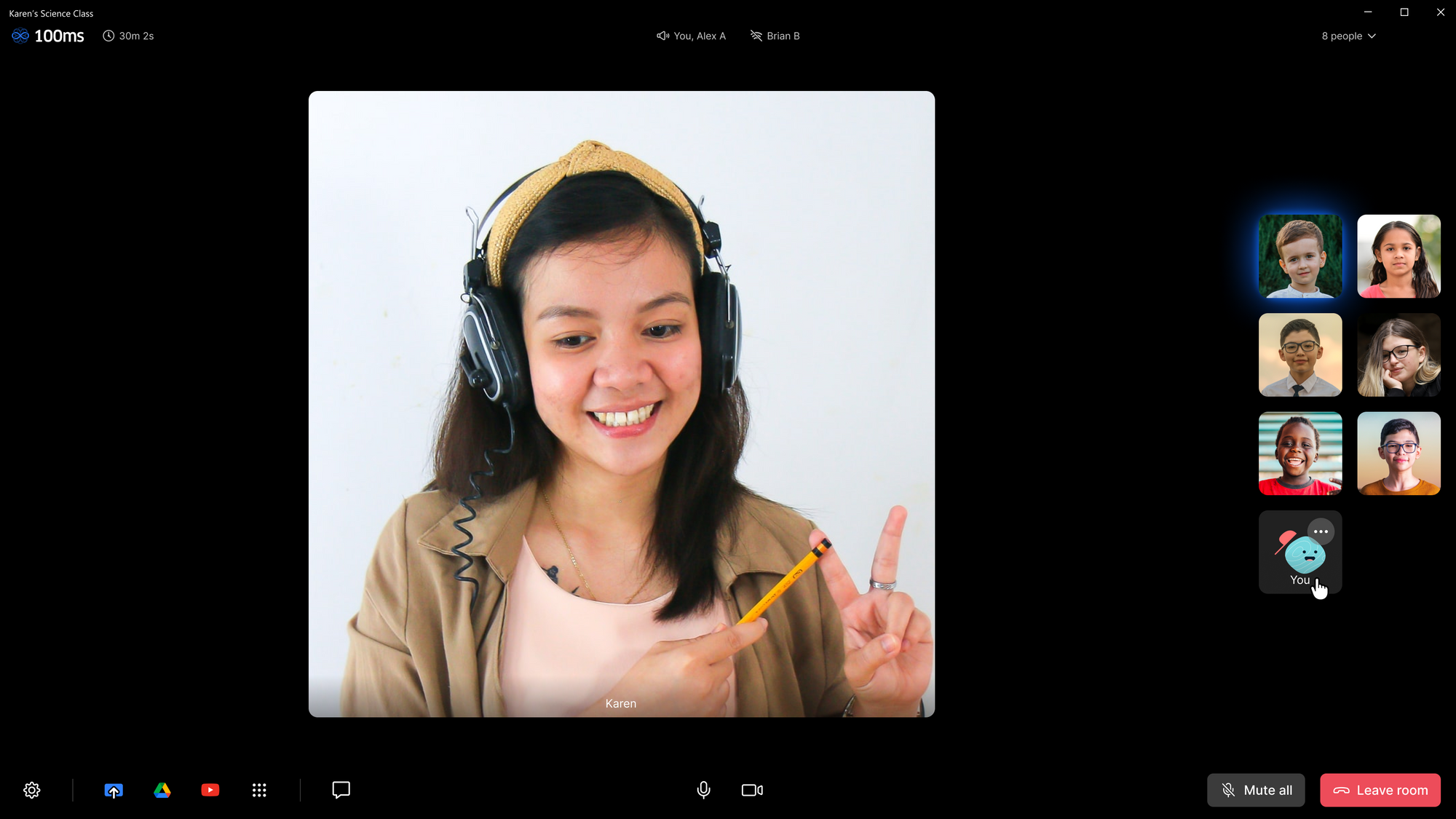
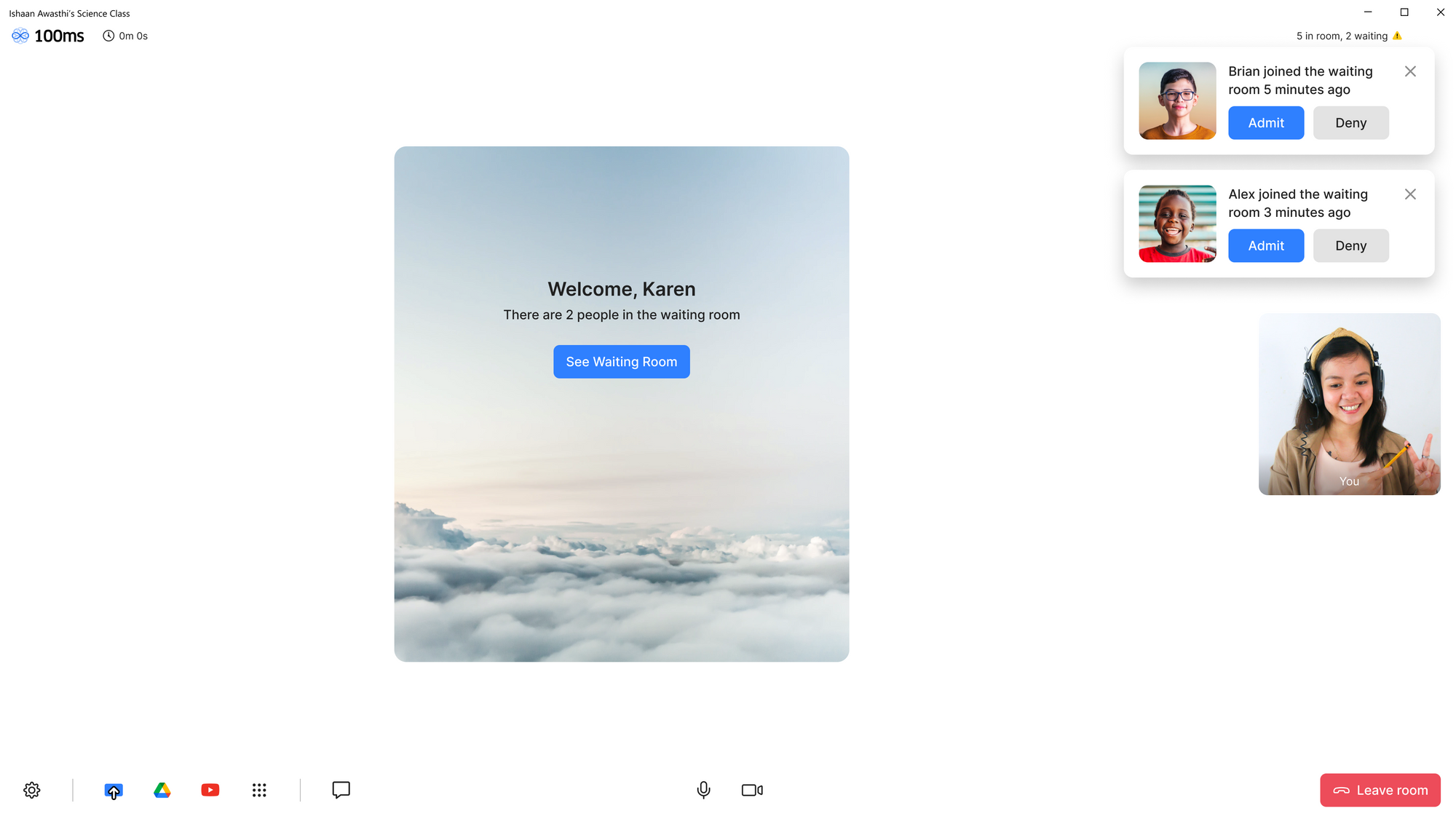
Let’s experience the product as Karen — a physics teacher conducting a remote class for 6 students.
You follow a link that brings you to a “pre-join” screen. You can adjust your settings and check your appearance before joining.

Two punctual students have been in the waiting room for some time already. You let them in.
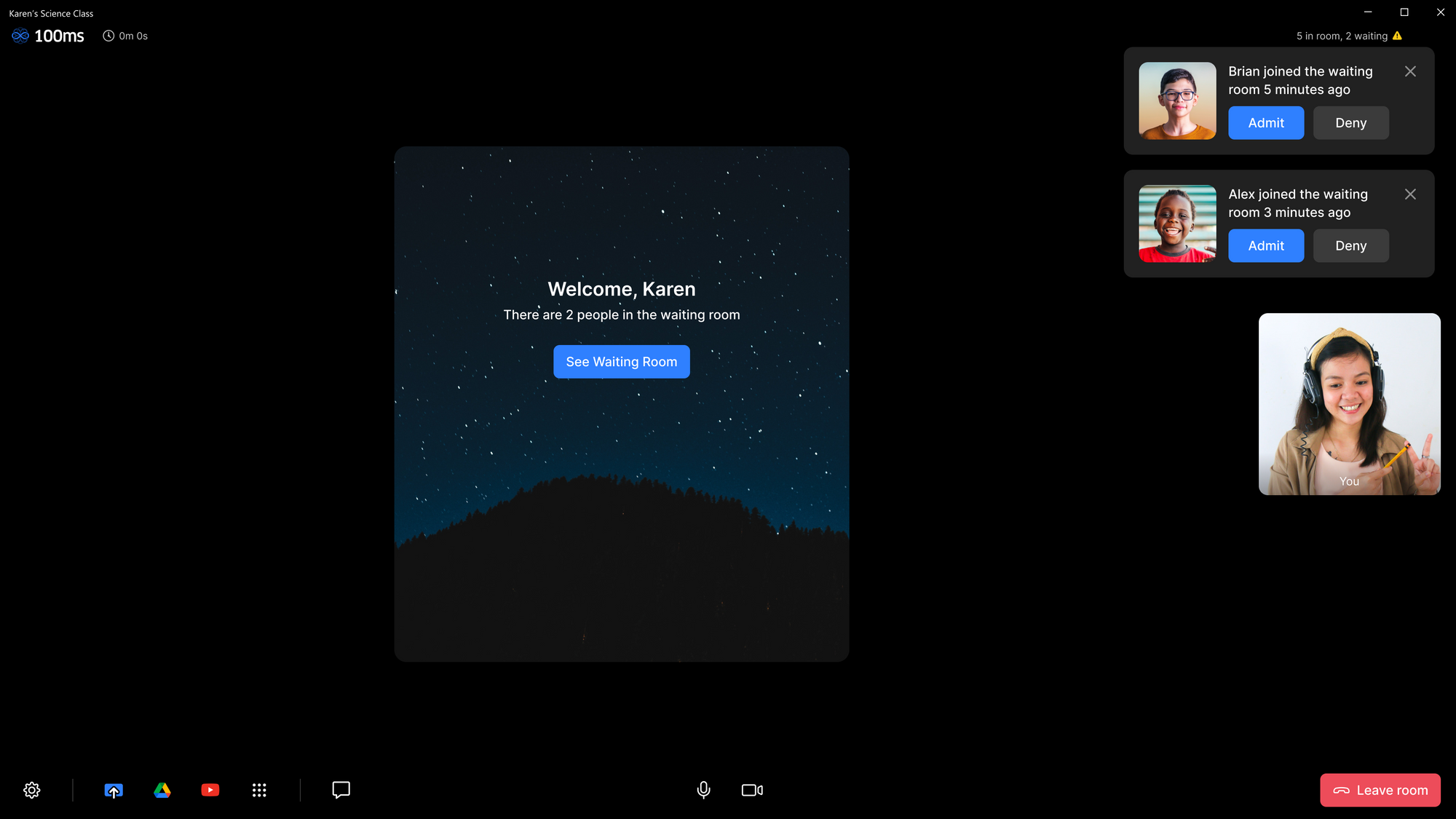
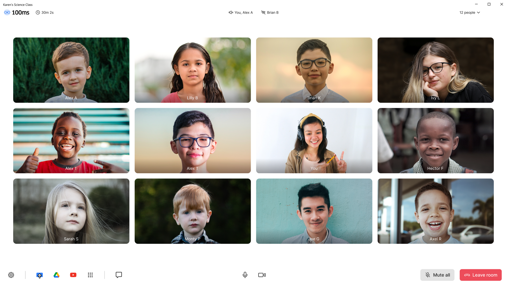
Class begins.
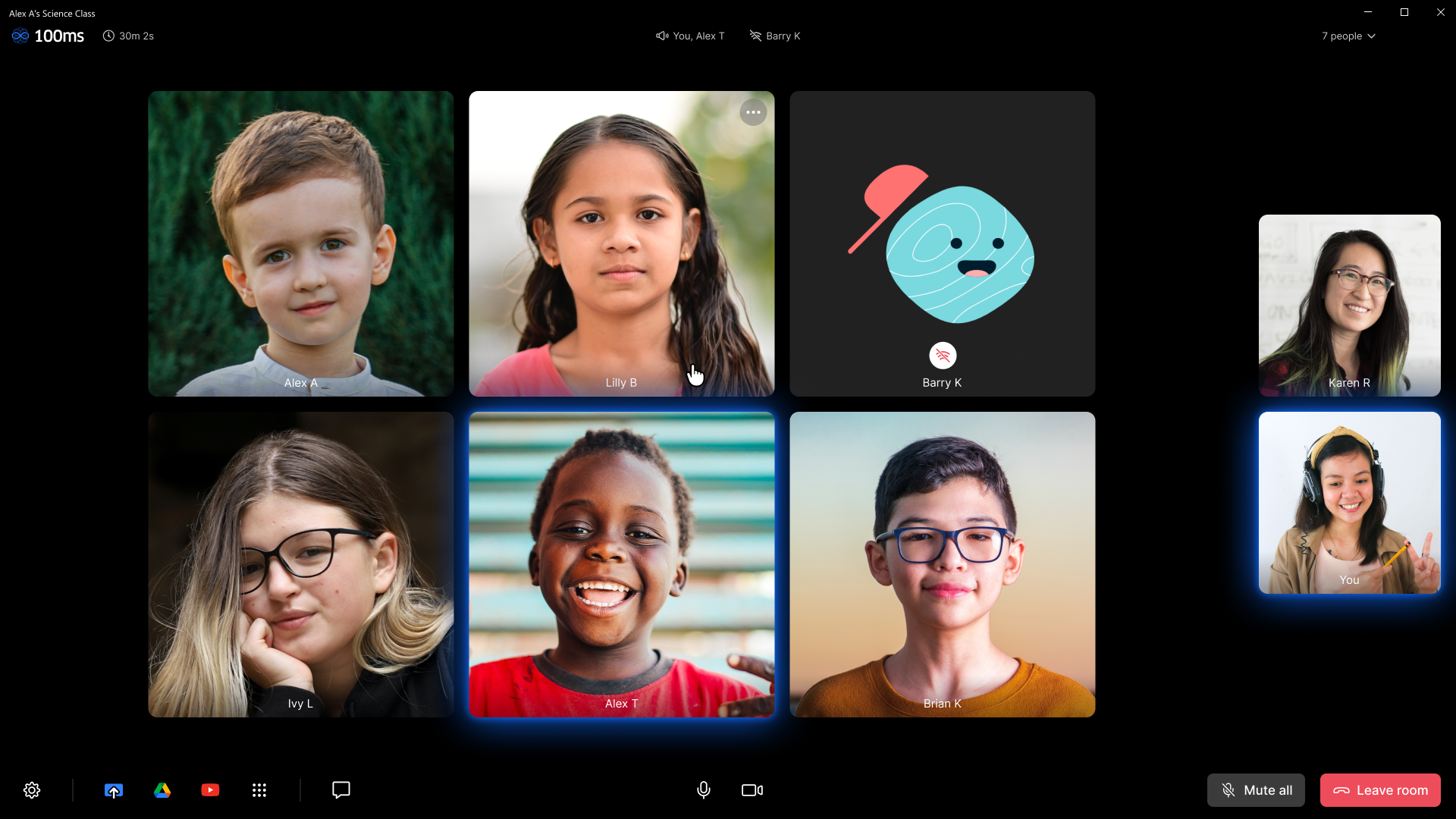
Some students are yet to switch on their videos. You note that Barry is experiencing internet issues so his video and audio might be choppy.
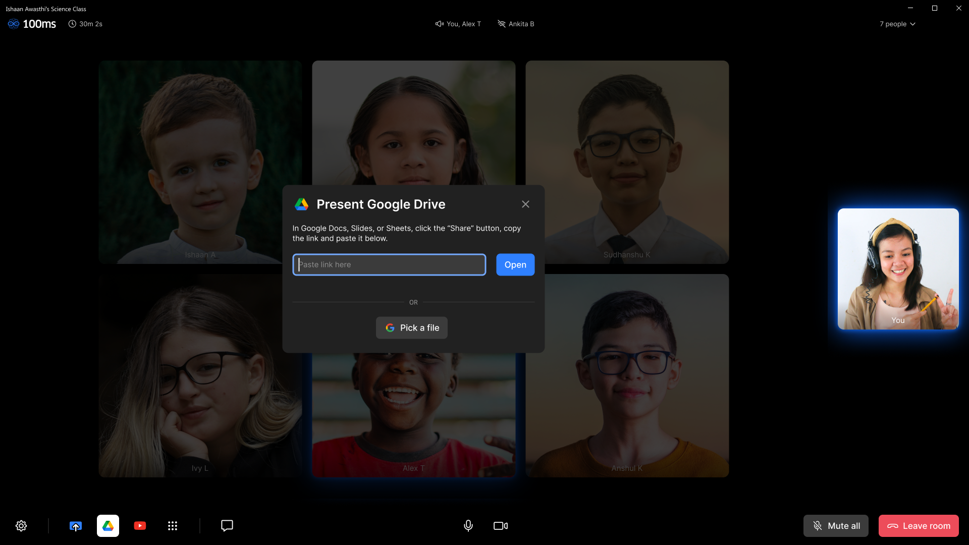
You start a Google Slides presentation directly in the app. No screen sharing or window management is required.
You invite students to draw on the slide along with you, making it a fun and interactive experience.
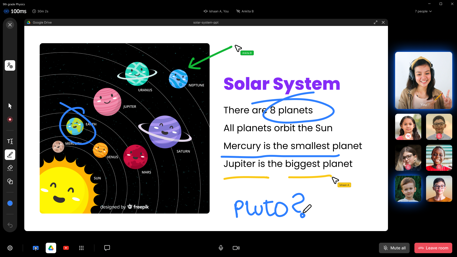
🌟 Delightful detail: on the top bar, note the indicators for “active speaker” and “poor internet connection”. With a single glance, find out whose mic is leaking background noise, or whose slow internet is causing choppy audio.
You close the presentation and continue teaching.
Some students have raised their hands to ask doubts. You keep an eye on the chat to stay caught up.
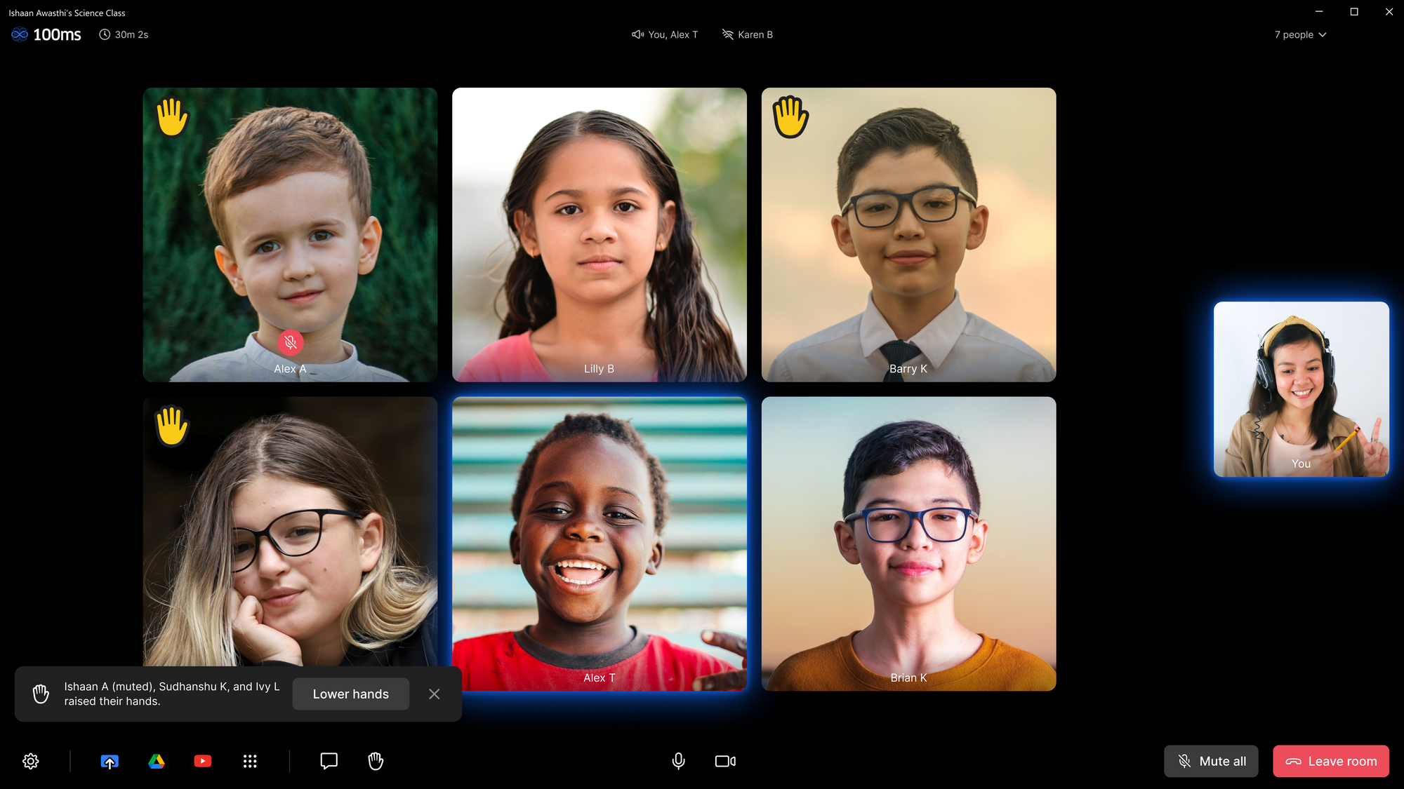
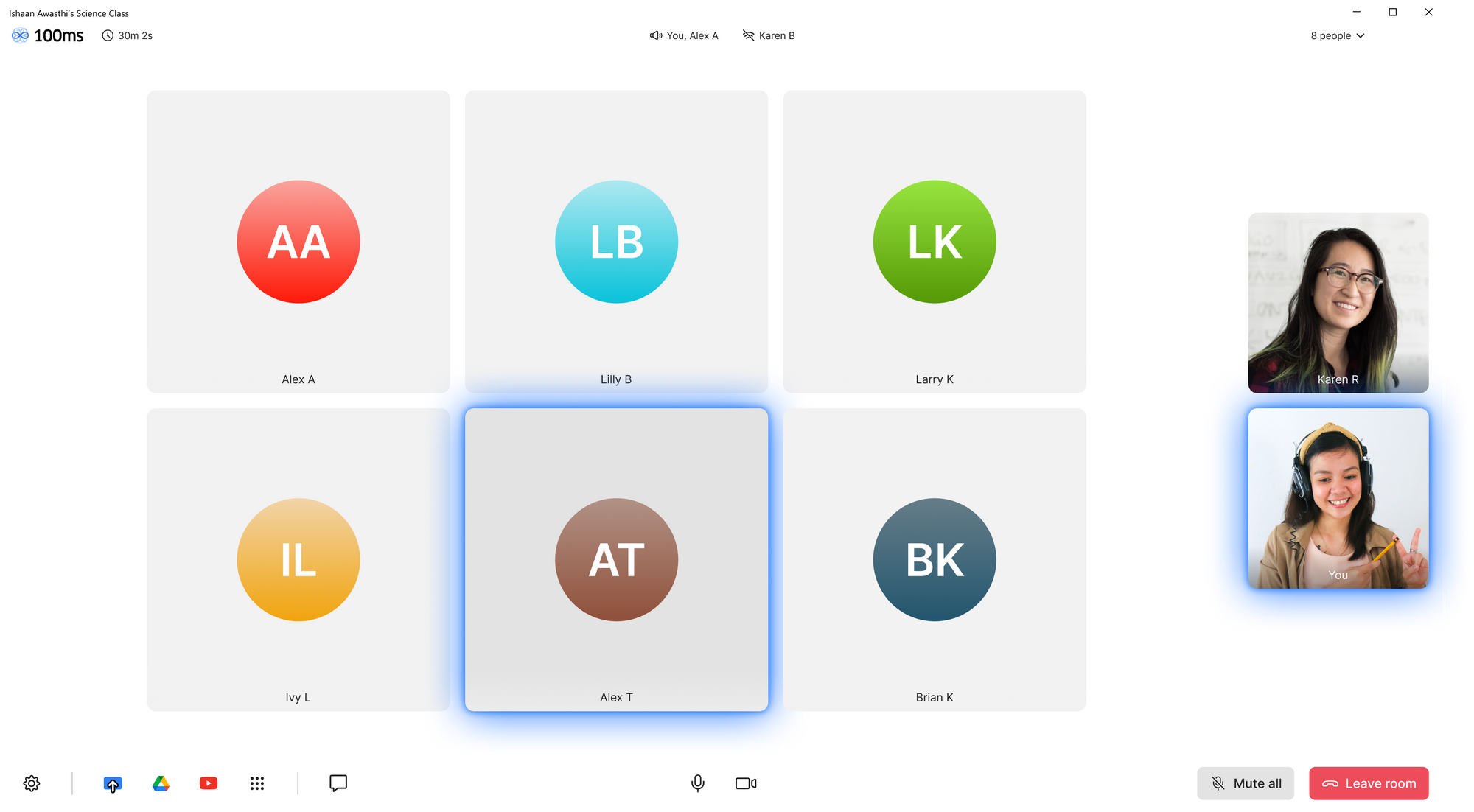
It’s time for Alex to read out his homework assignment to everyone.
You place him in the “Spotlight”. He is now the center of attention on every participant’s screen.

Class is finally over.
Once you end the room for everyone, you are taken to the “post-leave” screen.
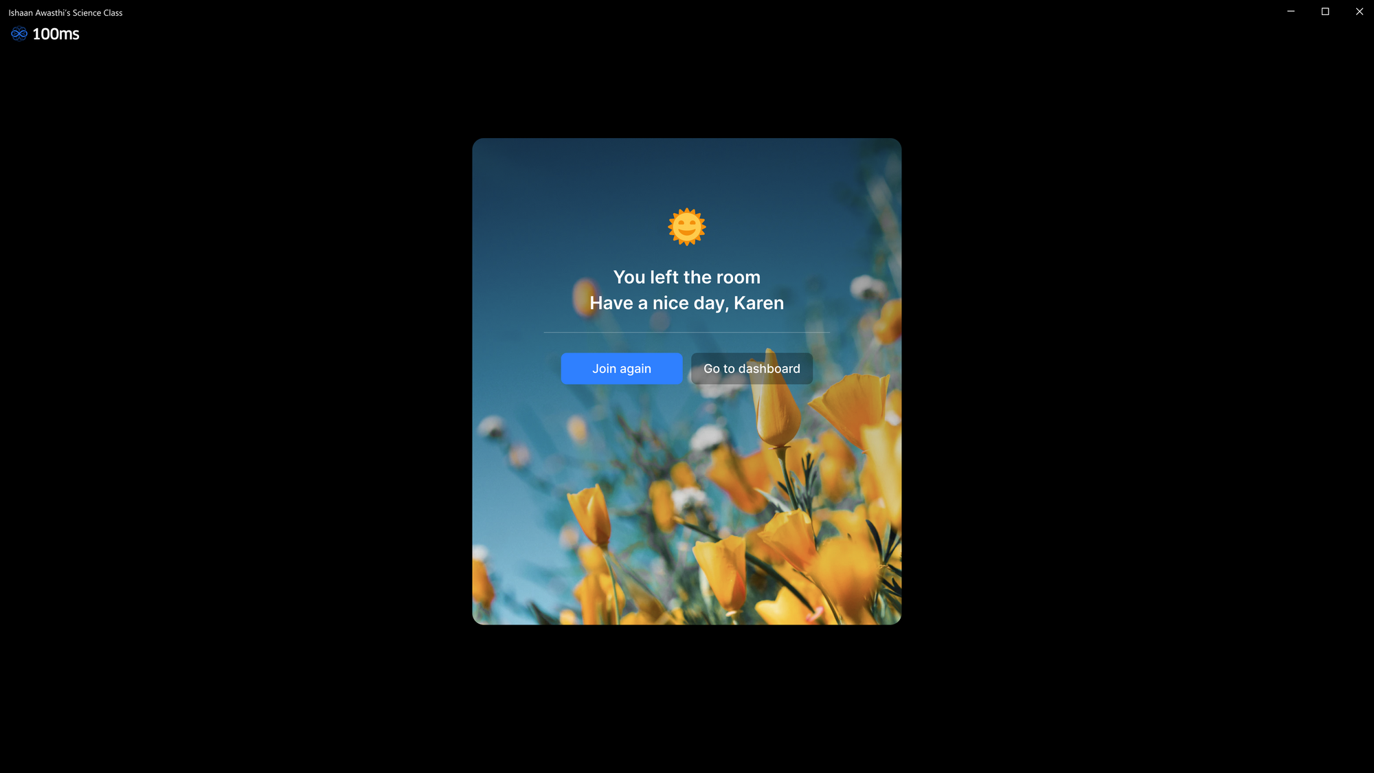
🌟 Delightful detail: Some flowers to remind you to go out and take a walk!
Endlessly configurable
Different layouts for different roles
For a teacher, it’s important that they see all the students at once and have full control over the class. But for students, it’s important that they see the teacher prominently.
Layouts for those in the Student role can be set to allow only the teacher on stage.
Light theme
Keep things simple with a light theme.
Wide tiles
We like square tiles because they focus on the face and reduce background distractions, but you can go wide if you like.
Classic monogram avatars
We made the monograms look so good you’ll want to lick them.
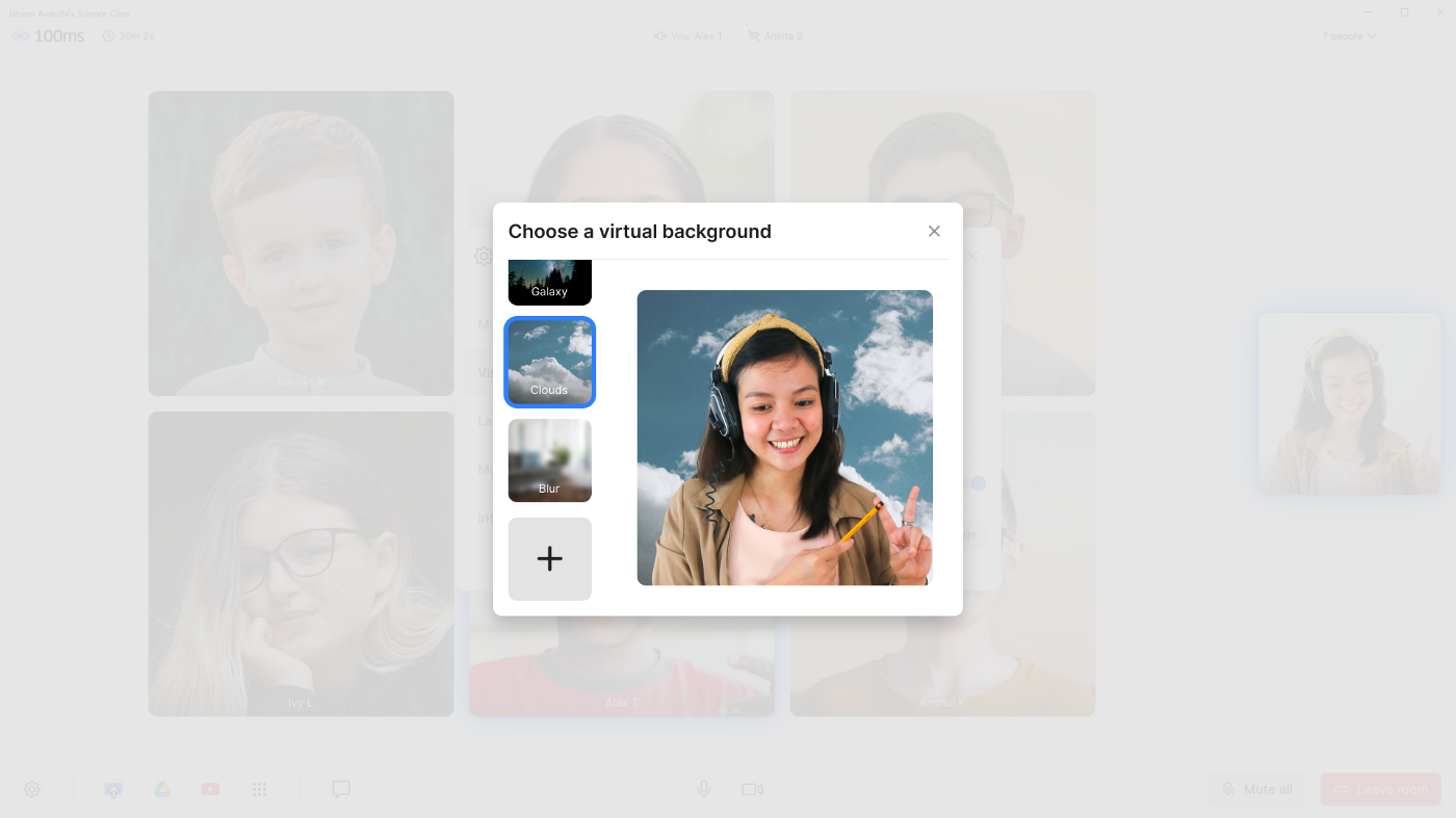
Virtual backgrounds
Use virtual backgrounds to reduce distraction and preserve privacy.
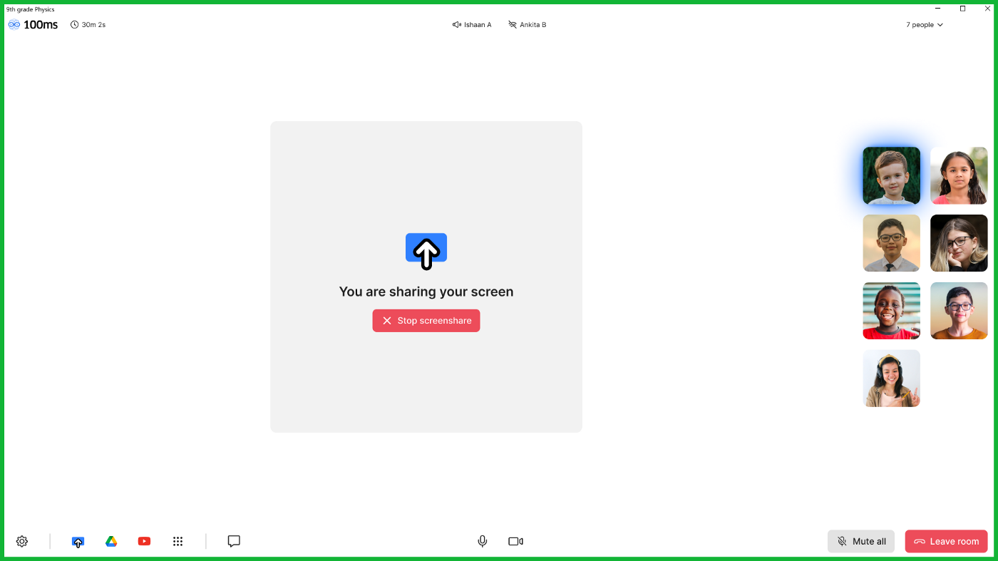
Screen sharing
Thanks for reading
We hope this article has left you with new insights into building robust and modular products that “just work”.
To learn more about 100ms, click here: www.100ms.live
Engineering
Share
Related articles
See all articles